Abra Academy
In the Abra Academy, it is fun to learn about app accessibility. We provide clear information and practical code examples. Our goal is to empower your entire team to build accessible apps.
How does it work?
The Abra Academy provides a knowledge base and e-learning. If you are designing, developing, or testing apps, our academy will help you to understand accessibility. Our content focuses on the most impactful areas of app accessibility. This approach ensures that you can effectively work towards an accessible app.
Accessibility issues detected by Abra Cloud, Abra Desktop and Abra SDK link to relevant resources in the Abra Academy.
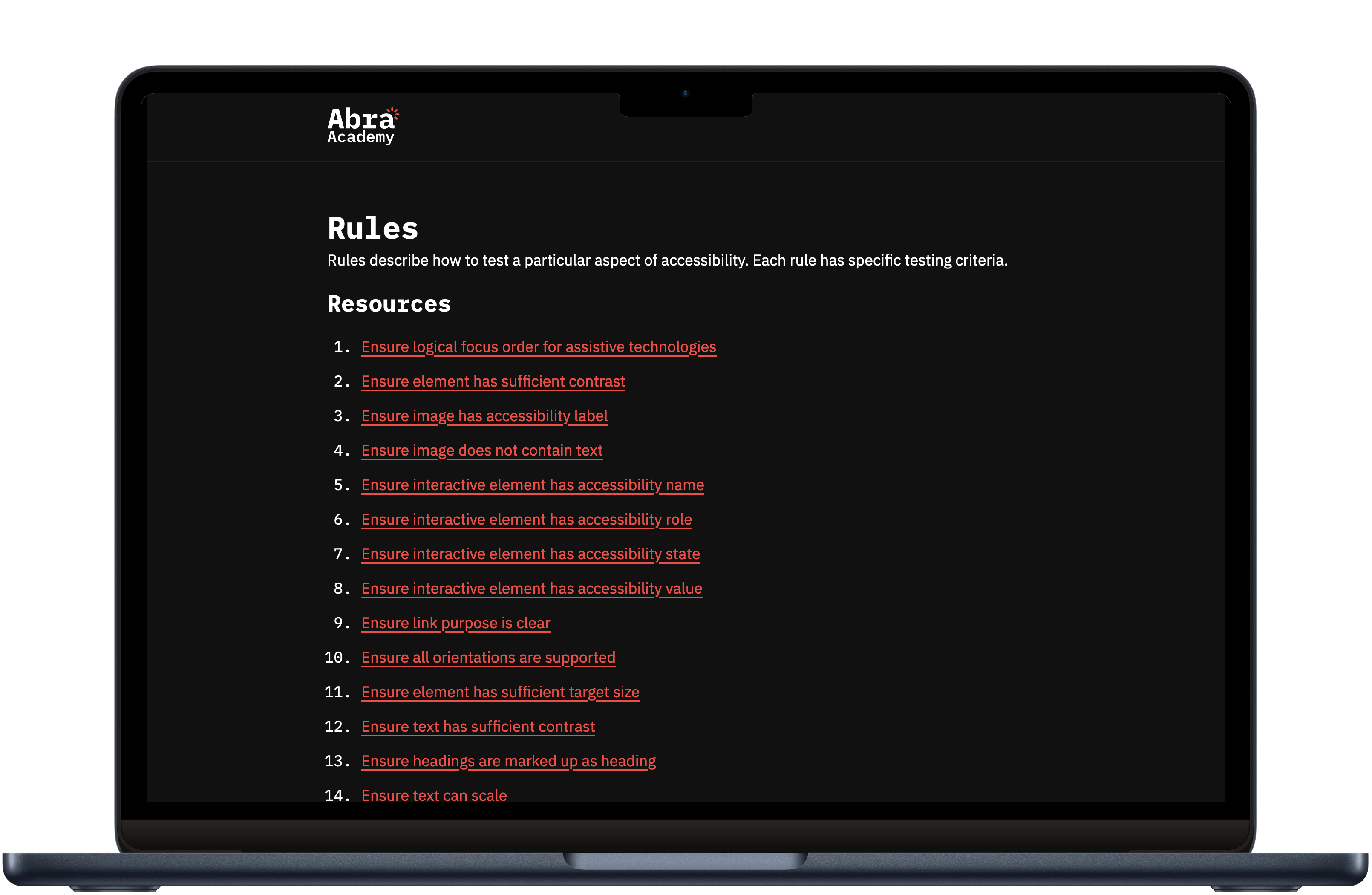
Knowledge base
Our knowledge base contains solutions for every accessibility issue found with the Abra Test Engine. We provide solutions for iOS (Swift), Android (Kotlin), Flutter, React Native and Xamarin. We aim to add solutions for SwiftUI, Jetpack Compose, .NET MAUI and Cordova in early 2024.
We also share our knowledge about the accessibility guidelines, such as the Web Content Accessibility Guidelines, EN 301 549 and Section 508. Furthermore, we explain how to build accessible components, such as buttons, switches, tabs, etc.
E-learning
We also provide e-learning, enabling you to learn everything about a certain topic. Our kick-off training is a great start for beginners to learn the basics of accessibility. We are working on in-depth developer trainings for multiple frameworks.
Explore trainings
We have trainings for designers, developers and testers. These trainings can also be offered in-company.
-


Kick-off training
Learn the basics of accessibility, perfect for beginners.
Enroll for free -
Testing training
Learn how to test app accessibility, we cover manual and automated testing methods.
Sign up -
Android training
A technical deep dive covering everything you need to know to develop accessible Android apps.
Sign up -
iOS training
A technical deep dive covering everything you need to know to develop accessible iOS apps.
Sign up -
Flutter training
A technical deep dive covering everything you need to know to develop accessible apps using Flutter.
Sign up -
React Native training
A technical deep dive covering everything you need to know to develop accessible apps using React Native.
Sign up -
.NET MAUI training
A technical deep dive covering everything you need to know to develop accessible apps using .NET MAUI.
Sign up
Frequently Asked Questions
-
Yes, Abra Academy offers online courses, allowing you to learn at your own pace. The training courses can also be given in-company.
-
Yes, when you complete one of our trainings, you will automatically receive a Certificate of Completion.
-
Yes, all of our videos are captioned in English. Some videos are also captioned in Dutch.
-
Our courses are designed for a broad audience, from beginners to experienced developers. Whether you're just starting out or looking to refine your skills, there's a suitable course for you.
-
Absolutely! Our knowledge base contains hundreds of solutions. Can't find a suitable solution? We will help you, and add the solution to our knowledge base.